Why the Problem Section Is the Heart of a Landing Page — and How to Design One That Works
Jerome Tana
11 สิงหาคม 2568

Table of Contents
Ever had a page that's beautiful — sharp images, a perfect color palette — but the stats stay flat, people scroll back and forth, and eventually everyone closes the tab? I see this a lot, and the spot where people usually “drop off” is the very top of the page, the moment readers decide whether to keep scrolling. That's exactly where the Problem Section comes in to help.
If the “problem” is told in a compelling way, it prompts people to keep scrolling and become ready to accept the offer, genuinely nudging conversion upward. UX principles stress that the top area decides whether someone keeps engaging, and it should communicate the value proposition clearly from the first glance.
What Is a Problem Section, and Why Does It Matter?
I use the term “Problem Section” for the short block near the top of the page (usually in the hero area) that poses a question / pokes at a pain point in a way that resonates, sets the problem's context clearly, then leads into the promise and solution over just a few lines.
- UX research/practice recommends that the top of the page act as a “filter” for attention, arranging text and images that help people decide whether to keep scrolling.
- Hero section best practices emphasize a short, sharp headline, a relevant image, and a context-appropriate CTA, to carry people from problem to solution.
- Landing page optimization articles/case studies show that arranging the text/images near the top to match the target audience's pain has a significant effect on conversion.
1) The Core Idea: use PAS as a “bridge” (Problem–Agitate–Solution)
The principle is that simply pointing out the problem sometimes doesn't work — you have to twist the knife so they feel it too lol
Write the Problem so it matches the real situation, add just the right amount of emotional impact (Agitate), then lead to the answer (Solution) without skipping steps.
Example (a document-management SaaS):
“Documents scattered everywhere, files you can't find, time wasted updating the latest version every week — the result is stalled deals and a burned-out team. Try organizing every file in one place, with automatic version tracking.”
A quick PAS checklist
- Problem: state a tangible situation + risk
- Agitate: add the harm that's happening / about to happen (but not too dramatic)
- Solution: briefly connect to the outcome after using the product/service
- Close with a single clear CTA (“Start for free,” “Watch a 3-minute demo”)
A common mistake: writing too broadly, making “everyone” the audience → in the end, no one feels truly addressed.
Open a note and write one PAS paragraph in the first 90 seconds.
2) The Message Structure in a Problem Section (a template you can use right away)
Core idea: use 3 short layers of text, easy on the eye
- Headline = the problem framed as an outcome
- Support line = the main cause/obstacle
- Bridge = the bridge to the promise + CTA
Example (an e-commerce shipping service):
- H1: “Orders stuck in the warehouse, losing sales because shipping is one day late”
- Support: “Tracking systems scattered everywhere, the team replying to chats until their hands cramp”
- Bridge+CTA: “All carrier statuses on one screen, start free for 14 days”
Checklist
- Line length: readable in 3–5 seconds
- Avoid unnecessary technical jargon
- A single, clear CTA that matches the arriving traffic's state (cold/hot)
A common mistake: putting 2–3 CTAs at the very top so they compete with each other.
Take your existing H1 and rewrite it into one version as a “problem framed as an outcome.”
3) Image and Layout: make the “problem” visible
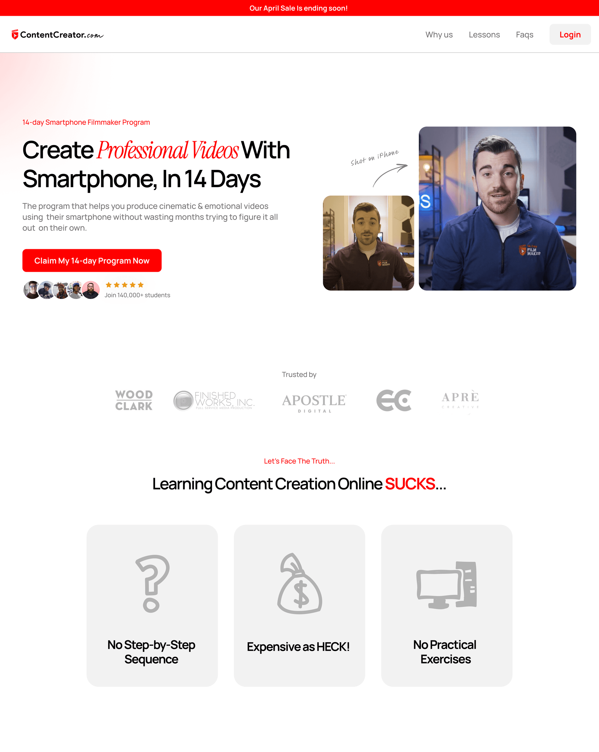
Core idea: the image in the hero/Problem Section should help tell the pain point or the usage situation (contextual imagery), not a generic stock photo.
Examples:
- SaaS: a real UI shot of “before–after” (before: errors/duplicate work, after: a clear status summary)
- B2B: an image of a team working with the equipment/documents that point to the problem
- Retail: a product image in the context that solves a specific pain
Image checklist:
- Relevant to the problem/context
- Enough contrast to make the headline stand out
- Doesn't obscure the CTA
A common mistake: choosing a beautiful but irrelevant hero image, which leaves the “problem” text feeling unanchored.
Mini-CTA: capture a product screenshot that reflects the pain and place it instead of a stock image.
Best practices on hero/hero imagery that aids conversion.
4) Match the Message to the “Problem Awareness” Level
Core idea: each traffic source has a different level of awareness, so the style of your Problem Section has to adapt accordingly.
- Problem-aware: use sharp language that hits the pain directly
- Solution-aware: reinforce the outcome and the deciding factors (faster, easier)
- Most-aware: emphasize the offer/guarantee/low risk (risk reversal)
Example: a Google Ads campaign on the keyword “reduce abandoned cart” = problem-aware → you can open with a strong problem right away; but organic traffic that searches the brand directly = most-aware → open more softly and invite them to start using it quickly.
Map your traffic sources → set the problem tone/CTA to match each one.
Don't use the same message for every channel. Make 2 versions — one for problem-aware and one for solution-aware — then A/B test them.
5) Measurement: set KPIs for the Problem Section
Core idea: measure both “are they interested” and “where do they click.”
- Above-the-fold engagement: scroll depth reaching 25%+, time on section
- Micro-conversions: CTR of the primary CTA, clicks on “watch demo/short video”
- Macro-conversions: sign-up/purchase/demo booking
Testing approaches:
- A/B test the headline (problem-as-outcome vs problem-as-emotion)
- Image: real UI vs contextual image
- Agitate slightly stronger vs softer
- CTA copy: “Start free” vs “Watch a 3-minute demo”
6) A “Before–After” Example (condensed)
Before (a repair-technician booking service):
“Full-service repair technicians for every home” → broad, doesn't reflect a problem
After (a revised Problem Section):
“H1: Waiting half a day for a technician, losing a whole day of work?
Support: Vague appointments, technicians rescheduling, the household in chaos
Bridge+CTA: Choose a technician who's actually available, with a confirmed time slot — check the schedule now”
7) The StoryBrand/Value Proposition crowd goes the same way
If you're familiar with StoryBrand, you'll know that “framing the problem” for the customer — who is the hero of the story — is the same core idea as the Problem Section. You just change the language and order to fit your brand's web page, while still placing the value proposition clearly from the first glance.
Common Obstacles, and How to Fix Them
- Writing too forcefully until it feels overbearing/relies too much on fear → use real data and everyday situations, no need for drama
- Irrelevant images → choose “before–after” images or usage-context images
- Multiple CTA buttons → choose just 1 goal at the very top
A good Problem Section = a sharply defined problem + a bridge to a tangible promise + supporting image/layout + a single CTA that leads to the next step. When you do all of this and test systematically, you'll see engagement and conversion signals tick upward, especially in the top area that serves as the first gate of the decision.
Pick one target page, write a Problem Section using the template in 3 variations, and start A/B testing this week.
แชร์บทความนี้

Written by Jerome Tana
Author at WEBCRAFTSMAN
Jerome Tana is a dedicated member of the WEBCRAFTSMAN team, specializing in web development, digital marketing, and creating exceptional user experiences.