Top 10 Web Design Mistakes (and How to Avoid Them in 2025)
Jerome Tana
11 สิงหาคม 2568

Table of Contents
In 2025, websites no longer compete on beauty alone — it's about delivering a user experience (UX) that makes users understand instantly, find it easy to use, and move toward a buying decision. This article shares 10 common mistakes, along with fixes that actually work.
1. Failing to communicate clearly within the first 5 seconds
The human brain scans a web page quickly to assess whether it's “worth the time” — if it doesn't know what your site offers, or the benefit isn't clear enough, within 3–5 seconds most users will close it or hit back (bounce) immediately. That's why we say First impression = Conversion opportunity
Psychologically: people use heuristics (decision-making shortcuts) — if the value isn't clear, the brain judges it “not relevant” and moves on to another option.
What users need to know instantly (3 quick points)
When the page finishes loading in 3–5 seconds, users should know (at least) these 3 things:
- What is this (What) — what is the product/service
- Who is it for (Who) — who benefits from it
- What do I get (Benefit / Why care) — the tangible outcome or advantage
If the page doesn't answer these 3 questions immediately, the chance of them staying is almost zero.
The Hero elements that must be clear (and how to do them well)
The Hero Area = the space above the fold that users see first.
1) Headline — the heart of clarity
- Principle: short, concise, focused on the outcome (benefit-first)
- A structure that works: [outcome] + [time/condition] — e.g.
- “Grow online sales 30% in 90 days”
- “Manage your shop's accounts in 10 minutes/day”
- A bad example: “Our company offers full-service solutions” (states no benefit)
- Tip: avoid vague buzzwords like “innovation” if you don't pinpoint what it solves
2) Subheadline — explain further in 1 sentence
- It expands the headline briefly: the how + who it's for
- Example: “Automation for SME shops that want to cut bookkeeping time by 70%”
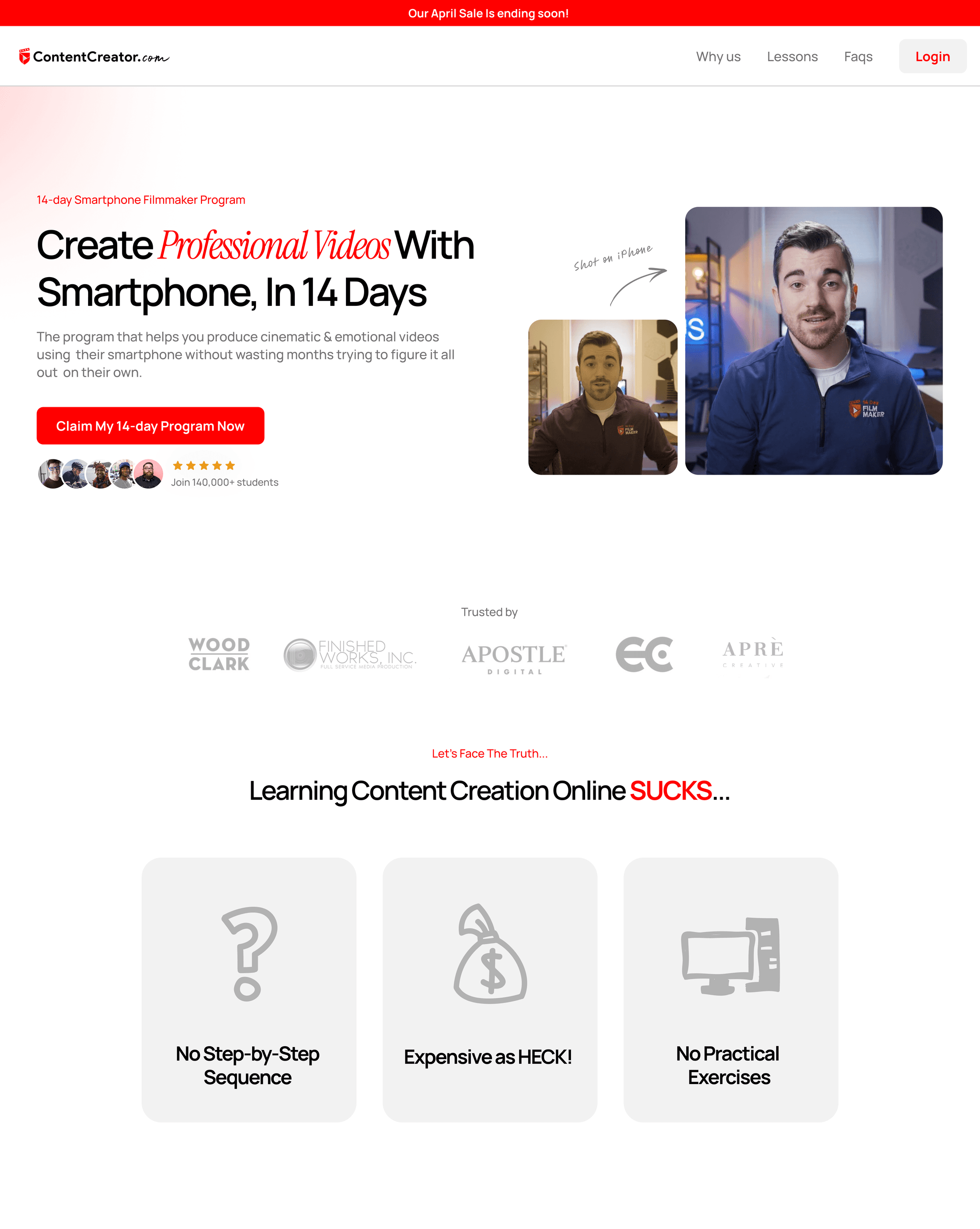
3) Hero Visual — an image/video tells the story faster
Recommended image types:
- Real users in action — people trust a real face on the page more than a stock photo
- Before / After — if the result is clear (e.g. a graph, screenshot)
- Short demo video / GIF (5–10s) — shows the UI in use or the result immediately
Watch out: the image must convey the result, not just look “pretty.”
4) A prominent, clear CTA
- The button text must say what will happen, e.g. “Start your free 14-day trial,” “Get a free website analysis.”
- The button color must have high contrast with the background, and be big enough to spot instantly.
- Place at least 1 CTA in the Hero, plus a secondary button, e.g. “Read the details.”
5) Microcopy near the CTA — reduce anxiety
- Add a short line under the button, like “No credit card required,” “Cancel anytime,” “Free for 14 days.”
- It boosts confidence instantly.
A Before / After example (a real one you can use)
Before (bad):
- Headline: “Our services”
- Hero image: a studio team photo (no context)
- CTA: “Contact us”
After (good):
- Headline: “Double your sales from your website in 60 days — for businesses with under 5,000 visits/month”
- Subheadline: “We analyze the problem points, optimize CRO, and build a funnel that works for you”
- Hero visual: a before/after conversion graph + a short testimonial screenshot
- CTA: a primary button “Get a free website analysis” + microcopy “No card required”
Headline/Subheadline writing techniques & example templates
- Template 1 (Result + Time): “[outcome] within [time]” → “Grow website visitors 30% in 60 days”
- Template 2 (Audience + Promise): “For [audience] — [promise]” → “For online shop owners — cut returns by 20%”
- Template 3 (Pain → Solution): “[problem] → [fix/result]” → “Slow-loading site → boost speed and capture orders instantly”
Accessibility & Performance (don't overlook these)
- Alt text on images should describe the benefit (not just “hero image”)
- Give videos captions
- Load the Hero asset with lazyload, but keep it large enough so it doesn't look like half of it is missing
- Reduce image sizes (WebP, AVIF) for page speed
2. An overly complicated menu
The menu, or navigation, is the map of your website — if the map is hard to read, people get lost, and they don't buy. A good menu isn't one that crams in every link; it's one that takes people to the “important pages” quickly and without much thinking.
Why a complicated menu is a problem
- Increases cognitive load — people have to think before clicking; when there are too many choices, decisions slow down or stop altogether
- Worse on mobile than desktop — multi-level menus on a big screen become frustrating repeated scrolling and tapping once shrunk to mobile
- Hurts both UX and SEO — an unclear structure means users can't find content, and bots may prioritize things incorrectly too
Example (Wrong vs Right)
- ✖️ Wrong: 12 main menu items, each with several layers of submenus — users open the page and feel lost, not knowing where to start
- ✔️ Right: 5 main menu items (Services / Pricing / Case Studies / About / Contact) — with the deep detail moved into each service's landing page
A step-by-step fix
- Audit first — open Google Analytics / Search Console to see what users actually click, and remove items almost no one uses
- Limit the main menu to 5–7 items — choose only the pages on the conversion path or with key information, such as Services, Pricing, Case Studies, Blog, Contact
- Progressive Disclosure — hide the deep detail within pages; don't dump everything into the menu, let people expand it as their interest grows
- Use a Mega Menu when necessary — if you have many categories, organize them into a systematically columned Mega Menu, with a search box in the menu
- Add Breadcrumbs — help users know where they are and go back easily
- Design Mobile-first — set priority items for mobile (the most important at the top) and give adequate tap area (target 44×44px or larger)
- Use clear labels — use words your audience understands (e.g. “Our services” is better than “Solutions” if a Thai audience will understand it more easily)
- Test with a Tree Test / Usability Test — have your target audience find content, then measure the success rate
- Measure with Heatmaps & Click Tracking — see where people actually click and adjust the menu based on data, not feelings
- Have an internal search — if there's a lot of content, make a search button prominent as a shortcut
Accessibility & Technical Tips (small but important)
- Support keyboard navigation (Tab order) and add ARIA roles for the menu, so screen readers read it correctly
- Avoid menus that rely on hover alone — mobile has no hover
- Check the contrast of the menu text so it's clearly readable in both bright and dark light
- Reduce JavaScript that makes the menu load slowly or respond sluggishly
Quick checklist
- Main menu ≤ 7 items ✓
- Breadcrumbs present on pages deeper than 2 levels ✓
- Internal search prominent enough (if the site has a lot of content) ✓
- Menu is easy to use on mobile ✓
- Menu tested with real users ✓
---
Suggested illustrations to include
- A diagram comparing sitemaps: a “complicated” one vs a “simple” one, to show the reduction in layers
- A Mega Menu example: showing the categorization and the search box in the menu
- A Mobile Navigation screenshot (Before/After): showing the problems caused by the old menu on mobile, and the fix
- A Heatmap: real clicks on the menu, to confirm the data and serve as evidence for the recommendation
- A Breadcrumb UI: an example of a clear Breadcrumb display
---
3. Text that's too dense and too long
In an era where information floods in fast, most internet users don't like reading long content in big blocks, because:
- Cognitive Load: dense, continuous text makes the brain spend more energy processing and interpreting it,
which makes people feel tired and choose to “skip” or “close the page” rather than read on - Reduced scanning:
user behavior on the web is to “scan” for “key information” quickly, not read word by word.
If the text is one big block with no clear headings or emphasis, people can't grasp the main points immediately - Reduced engagement:
content that's too long without good formatting makes readers bored and unmotivated to read to the end or follow the CTA you want
How to avoid it and techniques to fix it
1. Use bullet points / lists
- Break information into clear points
- Helps readers grasp the main points faster
- Example:
- Reduce redundant work
- Increase accuracy in recording data
- Easy to use across multiple devices
2. Insert headings and subheadings
- Split content into subsections by subheading
- Lets readers “scan” for the topic they're interested in instantly
- Adds a clear structure so the content doesn't look like one big block
3. Use short paragraphs
- Don't lump sentences together into a big block
- Break them into short paragraphs, no more than 3–4 lines each
- Keeps the eyes from tiring and makes it easier to read
4. Use visual elements
- Insert images, icons, infographics, or graphs to help convey information
- Visuals reduce the feeling of density and make the content more interesting
- Example: a ✔️ icon used in place of a bullet point adds brightness
5. Use highlighting & formatting
- Emphasize key words with bold or italics
- Use a color that contrasts with the background but is still easy to read
- Helps draw attention to the main points
6. Use a quote or callout box
- Separate out important text or a quote you want to emphasize into a special box
- Adds rhythm so readers can rest their eyes and focus
A Before/After comparison example
Before:
Our website offers full-service design and development for businesses of every type. We have a professional team ready to help your website stand out above competitors with modern design and complete functionality.
After:
- Full-service website design and development
- A professional team ready to help your website stand out
- Modern design, with complete functionality
---
Suggested illustrations for this article
- A Before/After image of a dense text block vs a text block that uses bullets and good spacing
- An infographic showing reduced cognitive load when text is laid out well
- An example screen of a page with headings, bullets, and visuals that aid scanning
---
4. Colors and fonts that don't match the brand
Color and font are the “visual language” that communicates a brand's identity without words.
When colors and fonts match the brand's personality, they make it easier for viewers to remember and trust it.
But if you use the wrong colors and fonts, or they don't match:
- The brand lacks identity (Brand Identity):
viewers won't know which brand this website is, or they'll confuse it with another brand,
which makes the brand image unclear and seem untrustworthy - Confused communication:
unsuitable colors or fonts may communicate feelings that conflict with the brand,
such as a brand that emphasizes professionalism but uses garish bright colors or a flashy font, making the overall look seem unserious - Reduced readability:
low-contrast colors or hard-to-read fonts make users spend more time and get annoyed,
until they leave the website quickly
Techniques for choosing colors and fonts that suit your brand
1. Use a Brand Guideline as the main reference
- If you already have a clear Brand Guideline, stick to it for consistency
- If you don't yet, you should start by creating a primary color set, secondary colors, and primary/secondary fonts that suit the brand's personality
2. Choose colors whose meaning matches the brand
- Each color conveys a different mood and feeling, e.g.
- Blue: trust, calm
- Red: energy, excitement
- Green: nature, freshness
- Choose colors that match the brand's character and target audience
3. Check the contrast between text and background
- Use a contrast-ratio checker like the WebAIM Contrast Checker
- It should have a contrast of at least 4.5:1 to be easy to read and accessible to everyone
- Light-colored text on a light background, or similar colors, should be avoided
4. Choose a font that matches the personality and is easy to read
- Serif or Sans-serif font?
- Serif often feels classic and trustworthy
- Sans-serif looks modern and friendly
- Choose a font that's easy to read on every device
- Limit yourself to no more than 2–3 fonts on a single website, for tidiness
5. Create a type hierarchy with size and weight
- Set clearly distinct sizes for headings, paragraphs, and buttons
- Use bold to emphasize important text
- Helps users scan the content and understand it more easily
6. Test across multiple devices and browsers
- Colors and fonts may render differently on different devices or browsers
- You should test to be sure the website looks good and is easy to read in every environment
---
Suggested illustrations for this article
- An example page using colors and fonts that match the brand vs a site using the wrong colors and fonts
- A chart of color contrast ratio between text and background
- Examples of using different fonts and the resulting feeling they communicate
- A mood board of colors and fonts suited to each type of brand
---
5. A slow-loading website
- In an era where users have many choices and limited time, website speed has become a key factor that determines whether users stay or leave your site immediately.
- Users decide very fast:
statistics from Google say that if a site takes more than 3 seconds to load, most users start to feel frustrated and are very likely to close the site immediately - Higher bounce rate (the rate of leaving the site immediately):
a slow-loading site often has a high bounce rate, which means users don't click or do anything further at all - Hurts SEO:
Google uses site speed as one of its ranking factors.
A fast-loading site gets a higher SEO score and is more likely to appear near the top - Lowers conversion rate:
customers who can't bear to wait tend not to complete a transaction or fill out a form, because of the poor experience
Factors that make a website slow
- Image file sizes too large:
uncompressed images, or images larger than necessary, make loading take a long time - Unoptimized code:
too much, or poorly managed, JavaScript or CSS can make the page load slowly - Low-quality hosting:
a slow server, or one far from the user, results in slow response - Loading many resources at once:
such as too many fonts, plugins, or external scripts
How to avoid it and techniques to speed up your website
1. Reduce image sizes (Image Optimization)
- Use modern file formats like WebP, which is smaller than JPEG/PNG but still good quality
- Compress images with tools like TinyPNG, ImageOptim
- Use image sizes appropriate to the display area (don't use high-resolution images beyond what's needed)
2. Use Lazy Load for images and videos
- Lazy Load means loading an image or video only when the user scrolls to it
- It reduces loading of unnecessary data early on, making the site open faster
3. Choose high-quality hosting and a CDN
- Use hosting that responds fast, with servers located near your target audience
- Use a Content Delivery Network (CDN) like Cloudflare or AWS CloudFront to distribute data to servers worldwide, making it load faster
4. Minify and combine CSS and JavaScript code
- Remove unnecessary whitespace and comments (Minify)
- Combine multiple files into one to reduce the number of requests (Combine)
5. Reduce the number of unnecessary plugins or scripts
- Check the plugins installed and remove the ones you don't use
- Avoid loading too many scripts from external sources, as they can slow down the site
6. Enable browser caching
- Tell the browser to store certain files on the user's device
- The next time they visit, it loads faster because it doesn't have to fetch new data from the server
---
Suggested illustrations for this article
- A graph showing the relationship between site speed and bounce rate
- A Before/After comparison of an image compressed and loading faster
- A sketch or diagram showing how Lazy Load works
- A diagram showing how an effective CDN and hosting work
---
6. Not mobile-friendly
In an era where mobile has become the main device for browsing, most users access websites via mobile more than desktop.
So if your website isn't mobile-friendly, or has poor UX on mobile, users will feel inconvenienced and usually close the site immediately without waiting.
Why does mobile matter?
- The share of mobile users keeps rising
currently over 70–80% of website visitors come from mobile.
If your site isn't well-suited to mobile, you'll lose a large group of customers immediately - Google emphasizes Mobile-First Indexing
Google uses the mobile version as the basis for SEO ranking.
If your site renders poorly on mobile, your SEO will be lower and your chances of being found will drop - Poor UX = high bounce rate
if buttons are small and hard to click, images don't fit the screen, or text is hard to read, users will close the site immediately
Common mobile UX problems
- CTA buttons too small, inconvenient to click
- Long text and tiny fonts that are hard to read
- Images and elements that don't resize to the screen (not responsive)
- Slow loading, because images or code aren't optimized for mobile
- A menu or navigation that's hard to use
How to avoid it and fix it systematically
1. Design Mobile-First
Start designing the site by making the mobile version easy to use first —
from content structure, button sizes, spacing, fonts, and images —
then expand to the desktop version.
2. Use Responsive Design
Use CSS Media Queries so the layout automatically adapts to the screen size.
The site will look good and be easy to read on mobile, tablet, and desktop alike.
3. Adjust button and tap-area sizes appropriately
Buttons should be big enough to tap on a mobile screen (at least 44x44 pixels).
Leave space between buttons so users don't accidentally tap the wrong one.
4. Test on multiple screen sizes and real devices
Use tools like Google's Mobile-Friendly Test or Browser Developer Tools.
Don't rely on just desktop or a single phone.
Try opening the site on several phone models and screen sizes to see whether the UX is truly good.
5. Reduce sizes and load only the images needed on mobile
Use Lazy Load techniques and choose smaller image versions to speed things up.
6. Make the menu and navigation easy to use on mobile
For example, use a Hamburger Menu or a dropdown-style menu that isn't cluttered and is easy to tap.
---
Suggested illustrations for this article
- A comparison image of a non-mobile-friendly site vs a responsive site
- An example image of a too-small button vs an appropriately-sized button on mobile
- A screenshot of Google's Mobile-Friendly Test
- A diagram showing the Mobile-First Design process
---
7. An unappealing CTA button
A Call-to-Action (CTA) is a button or text telling users what to do next, like “Buy now,” “Sign up,” or “Download free.”
But if your CTA button doesn't stand out or isn't clear, users won't know where to click, or they may ignore it entirely.
That's why many websites have lots of traffic but low conversion — because the CTA isn't effectively calling for action.
Why does the CTA matter?
- It's the point that turns viewers into customers
if the CTA is clear and prominent, it prompts users to click and take the action the business wants - Reduces user confusion
a clear CTA button keeps users from hesitating, so they don't waste time wondering what to do next - Directly increases conversion rate
no CTA, or a poor CTA, means a clear drop in sales opportunities
Common CTA problems
- A faint button that doesn't differ from the background
- Vague button text that doesn't communicate clearly
- A button too small, or hidden in a hard-to-see spot
- Too many buttons, creating confusion
- No visual emphasis, e.g. no whitespace around the button, or no hover effect
How to avoid it and design an appealing CTA
1. Use a color that clearly contrasts with the background
Choose a button color that stands out and differs from the site's main color —
e.g. for a blue-toned site, use an orange or red button to draw the eye.
Don't use a color that blends into the background, because it makes the button “disappear.”
2. Button text must be clear and to the point
Use concise words that convey what the user will get, e.g.
- “Download free” instead of “Click here”
- “Get a discount now” instead of “Submit” —
the text should be motivating and convey a clear benefit
3. Button size and position
Make the button an appropriate size, not too small to tap.
Place it where users easily see it, e.g. near important text or in the center of the screen.
Leave whitespace around the button so it doesn't look cramped.
4. Limit the number of CTA buttons appropriately
You should have 1–2 main CTAs per page so users aren't confused.
If there are several options, prioritize them clearly.
5. Add small animations or effects
Such as a color change on hover (hover effect).
A shadow or slight movement helps draw the eye more.
Suggested illustrations for this article
- A comparison image of a prominent CTA button vs one that blends into the background
- Examples of clear vs unclear CTA text
- A heatmap image showing where users focus on a page
- A diagram of CTA button placement on a landing page
8. Lacking social proof
Social proof is social evidence that confirms your brand or product is already trusted by others.
When users see that others use the service and are satisfied, they feel more confident in deciding to buy.
Why does social proof matter?
- Reduces the anxiety and risk felt by new users who don't yet know the brand
- Builds credibility so the brand looks serious and professional
- Increases conversion rate because people tend to trust recommendations or reviews from real users more than information straight from the product owner
Problems that arise when there's no social proof
- Visitors feel unsure and hesitant to decide
- A lack of emotional connection with the brand
- Low sales, even with high traffic, because users don't see enough reason to trust it
How to avoid it and add social proof to your website
1. Add real customer reviews
Choose reviews that are detailed and clear, with storytelling that describes the problem and the result after using the service.
They should include a photo or real name (if the customer permits) to add credibility.
2. Display logos of key customers or partners
If you've served well-known customers or have credible business partners, you should display their logos.
It helps create an authority bias, making users feel “if this brand uses the service, then we're choosing correctly.”
3. Use interesting statistics
Such as the number of customers served, sales figures, satisfaction scores, or the percentage results customers achieved.
These numbers make the information feel tangible and more credible.
4. Video reviews
Video reviews from real customers build strong emotion and credibility, because you see the face, voice, and genuine feeling.
They can be used effectively on a landing page or social media.
9. Using too many stock photos
Using repeated images, or stock photos that look unnatural, on your website is one of the mistakes that greatly affects the credibility and the feelings of your visitors.
Why are repeated and insincere images a problem?
- Reduced credibility
when users see the same image repeated, or a stock photo that looks commonly used everywhere, it makes them feel the website lacks attention to detail, or just “borrowed” the images carelessly - Reduced emotional connection
insincere images, or images that look staged, make viewers feel distant, lacking humanity, so communicating through the image doesn't reach the emotions - Reduced brand distinctiveness and identity
repeated images make the site look like any generic site, with no uniqueness or standout difference, which affects long-term brand recall
How to avoid it and use images professionally
1. Use real photos of your team, customers, or location
Photographing your real team while working or in real situations makes the website look lively and credible.
Real photos of customers receiving the service, or real photos of the company's location, also build confidence and a sense of connection with visitors.
2. Choose stock photos that look natural and aren't overused
If you must use stock photos, choose ones that look like they were taken in a real situation, not ones that look exaggerated or too staged.
Avoid images frequently seen on other websites, or images that look too much like advertising.
3. Edit images to have a distinctive style
Use color grading, or add branding graphics like a brand-color overlay, to make the image feel like part of the site and match the overall style.
4. Avoid reusing the same image across many pages or sections of the website
No matter how good an image is, using it too often creates a feeling of boredom and reduces sincerity.
You should plan images to suit the content of each page appropriately.
10. Not tracking results and improving
Releasing a website without tracking results or analyzing data is missing a key opportunity to continuously develop and improve the site's performance.
A website isn't just an online storefront you open and forget — it's a system that has to “learn” and “adapt” to user behavior and the ever-changing market.
Why is not tracking results a problem?
- You don't know what works and what doesn't
if you don't collect data on what users do on the site — like where they click, which sections they linger on — design or content that's genuinely good won't be used to improve performance - You lose the chance to increase conversions and sales
a website not improved according to user data may lose the chance to turn viewers into customers, because it doesn't meet their needs or solve real problems - Your ad budget isn't worthwhile
running ads or SEO to bring lots of people to the site, but the site isn't good enough to produce high conversion, is like “pouring water into sand” — money spent for nothing
How to avoid it and track results effectively
1. Use Google Analytics to its full potential
Google Analytics is a free tool that helps us understand user behavior, such as
- Number of visitors (Traffic)
- Source of visitors (Source/Medium)
- Popular and abandoned pages (Bounce Rate)
- Entry and exit paths (User Flow)
Setting up a Goal or Conversion Tracking to see whether users do what we want, such as clicking the buy button, filling out a form, or signing up
2. Use a heatmap to analyze where users are interested
A heatmap is a tool that shows an overview of where users click or drag the mouse most often, such as
- Hotspots, or the spots that get the most attention
- Spots that are ignored, or positions users tend to scroll past
- It helps plan the placement of CTAs or content appropriately
Recommended tools include Hotjar, Crazy Egg, or Microsoft Clarity
3. Run A/B testing to test various hypotheses
A/B testing means creating several versions of a page, then splitting your audience to see different versions, to find which works better, such as
- Testing the headline
- Testing the CTA button, color, or text
- Testing images or the layout of elements
Making decisions with real data instead of guessing helps the site continuously become more effective.
แชร์บทความนี้

Written by Jerome Tana
Author at WEBCRAFTSMAN
Jerome Tana is a dedicated member of the WEBCRAFTSMAN team, specializing in web development, digital marketing, and creating exceptional user experiences.